


The Intriguing Typography Error of Space Shuttle Discovery
Introduction to Space Shuttle Discovery
The Space Shuttle Discovery, a critical part of NASA’s fleet, played a significant role in space exploration. Launched in 1984, it accomplished a remarkable 39 missions, spending a total of nearly one year in space and traveling approximately 150 million miles.
Regarded as the “jewel in the crown” of the Space Shuttle program, Discovery has been hailed for its reliability and performance throughout its operational lifespan, which spanned 27 years.
A Curious Observation
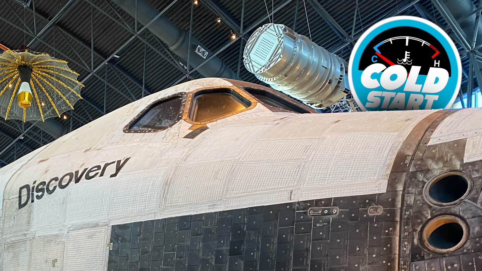
Recently, a social media post pointed out an unusual feature of Discovery that had gone unnoticed by many, including seasoned space enthusiasts. The post raised the alarming observation that the letter ‘s’ in the orbiter’s name, as displayed on the starboard side, appears to be upside down.
Images shared online prompted a reevaluation of the typography displayed on the shuttle, revealing that indeed, the letter has been rotated 180 degrees.
Analysis of the Typography
NASA’s guidelines stipulate that the graphics on space shuttles must use Helvetica Medium font, which is known for its clean and modern appearance. Upon examination, the misalignment of the ‘s’ stands out, as it differs slightly from the standard Helvetica ‘s’, which has a wider base that contributes to its visual stability.
Notably, this typography blunder was part of a larger effort, wherein stencils and space-grade paint were utilized to apply names and other graphics on the shuttle. The unique contours of the shuttle’s fuselage may have contributed to the misapplication of the stencil used for the letter ‘s’.
Historical Significance and Legacy
The presence of the upside-down ‘s’ remained unnoticed for nearly three decades of active service, which raises interesting questions about oversight in high-stakes environments. Despite the precision involved in other graphics, this peculiarity adds a unique character to Discovery’s narrative.
Many enthusiasts now feel a renewed appreciation for this imperfection, recognizing it as a notable aspect of the spacecraft’s history. As detailed analysis continues, the story of Discovery’s typography serves as a reminder that even in the realm of science and engineering, human oversight can lead to unexpected and charming outcomes.
